What do you get when you mix a fabulous sketch designed by Allison Davis with a Moxie Fab World Cityscapes Are On The Rise Challenge? A layout that came together with relative ease. Here's the sketch:
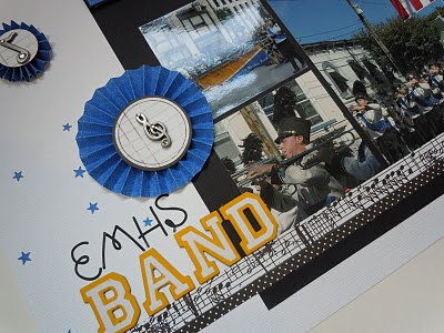
You can find more of Allison's sketches on her blog. The thing I love most about her sketches is that the accommodate lots of pictures I kept the placement of the pictures the same as they are in the original sketch design but I flipped the mat and, with a little help from my Cricut, I turned the swoosh from the bottom of the page into a cityscape at the top of the page. Here's my layout:
Here's a close-up of the journaling block and the cityscape. I cut it out using both the regular cut and the block shadow cut so that it would really pop.
The journaling reads: October 2010-- Mark, what a busy weekend you had. First, you marched in the Columbus Day Parade in Huntington on Saturday and then in New York City on Monday. I hope you always remember the excitement you felt when you first stepped off onto Fifth Avenue and started to play for the cheering crowd. All you hard work and practicing paid off since EMHS placed third in the competition!
I've had those music brads in my stash forever and thought now was the time to use them. However, when I matted them on just the labels and adhered them to the layout, they seemed like they were missing something. That's when I got the idea to make my own rosettes using this tutorial. It was really simple to do but I would not recommend making them without a scoring board!
I'll be back tomorrow to share my 7th LOAD layout.
Supplies:
Cardstock: American Crafts
Patterned Paper: Doodlebug (Blue Jean Filigree): American Crafts (Dear Lizzy Friendly Finch); Making Memories (Black Small Dots); 7 Gypsies (Kilburn);
Tools: Cricut (Plantin School Book): Martha Stewart Edge Punch(Stars); Martha Stewart Scoring Board;
Stickers: American Crafts (Sarah Script Black); American Crafts Thickers (ABC Letterman Mustard); Basic Grey (Basics Sticker labels);
Embellishments: Music brads from my stash.


4 comments:
Wow- this one looks very "professional"... like a page out of a yearbook or something! (at least when looking at the picture of it vs the actual/3D version)
great scrapbook layout!
Love how you incorporated the city scape into your layout. Very nicely done!
Hey Linda! Thanks for entering the Cityscapes Are on the Rise challenge in the Moxie Fab World! I'm so glad you joined in on all the fun! :)
Post a Comment